These days, we all shop online, and we all know that the most important and sometimes frustrating part of the shopping experience is finding exactly what we are looking for. Most of us rely on the site navigation to be the most organized and efficient way of purchasing the item we are looking for, but many sites fall short and end up losing potential revenue. There are five areas of the navigation that are the most important for consumers and businesses alike.
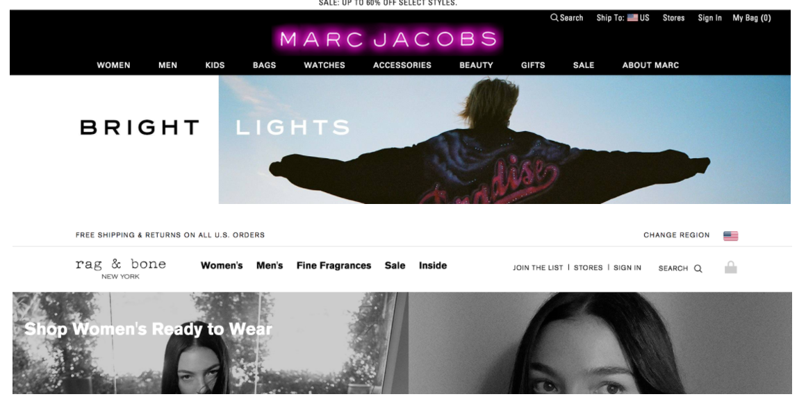
Let’s start with the most basic piece of the navigation - the logo. Your logo represents your brand. It is what consumers remember and it is what makes company identifiable. Even if you don’t know how to pronounce Louis Vuitton or know what LV stands for, you recognize the logo. It’s everywhere, and it represents luxury. Because the logo is so important to the business, it should be the first thing consumers see. People read left to right and therefore their eyes tend to move in a capital E shape. Make your logo obvious by placing it on the left side of the navigation bar or above the navigation links. Additionally, it is standard that the logo represents the home page on the site, meaning it is unnecessary to have a “Home” link next to the logo.
Right!
Wrong!

Moving to the right, you will undoubtedly have additional links available. Most likely something like “Shop Men’s” and “Shop Sale”. These links should focus on conversion and be simple to understand. Navigation is ultimately an information tree so the top level should be as basic as it can be and the drop down should allow for deeper filtering. Additional links like “About Us”, “Customer Care”, and “Shipping” belong in the footer.
Most of us enjoy a good sale. In fact many shoppers wait to buy until sale season, and the site front is the perfect place to advertise your upcoming or current sale, preferably in a promotion bar. Typically the “promo bar” sits above the navigation, just below the URL. Some sites have a persistent promo bar that they use to show free shipping or encourage customers to sign up for their newsletter, while others only show it during major sale times, like End of Season or Fourth of July. The promo bar is meant to be attention grabbing so it is important to make it a distinguishable color and underline the verbiage that can be clicked. If you have a coupon code, place it here as well.
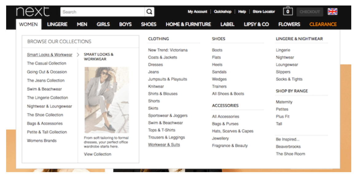
Now onto the trickiest part - the drop down navigation. This is where many customers bounce away from the home page. Often dropdowns are overwhelming and too detailed with imagery that is distracting, multiple colors or uncommon naming conventions. If you have a unique set of products that require customers to educate themselves, keep the navigation simple so they can focus on a few product categories at a high level before diving into the specific items.
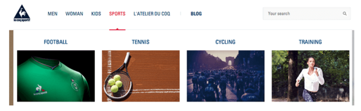
If you have a very recognizable product, such as clothing, you can expand the navigation while using industry standard verbiage.
The navigation should make finding what your customer is looking for as simple and easy as possible. Consumers know that there is no shortage of retailers available to them and if they can’t find what they are looking for quickly, they will move on to another site.
Last, but certainly not least, is to ensure that your navigation is sticky. This means that when a customer starts scrolling, the navigation sticks to the top of the page. This allows them to click from one page or category to another without scrolling all the way back to the top. Even sites that have a “Back to Top” button at the bottom don’t perform as well as those with sticky navigations - it is becoming the industry standard. You can find some excellent examples of sticky navigations here and here!